Over the past few years in the App Store, I’ve had apps that have varied from extremely poor performance to chart topping performance with millions of downloads. One of the key factor’s to an app’s success is the app icon. There are several attributes that I have found generally lead to more downloads. I will also show you how to find the best icon designers in the world. This is the Part 2 of a 3 part series on how to optimize your app store presence. You can also check out how to write a good App Store description.
Icon Styles
I believe the best way to learn is by example, so I will start this post by showing you some of the best icons in the App Store.
Games
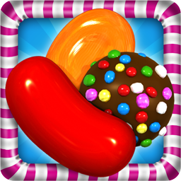
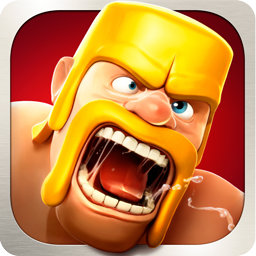
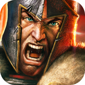
These 3 icons are from some of the highest grossing games in the App Store. As of this posting, Candy Crush is #1, Clash of Clans is #2, and Game of War is #4.
An interesting thing to note about Candy Crush and Clash of Clans is that they both have an icon border and have a 3 dimensional component where the subject of the icon overlaps the border. This really causes the icon to pop out and get more attention. The other important thing to notice is that the subject of the icon is huge and occupies most of the icon.
What is interesting about Clash of Clans and Game of War is that they are copying each other. The angle of the face, the expression, even going down to the saliva that is sticking between the bottom and top of their mouths. This is important to note if you are in any kind of competitive market for your app and you are trying to beat the competition. See what they are doing and do it better.
What a game icon needs:
- Immersive – Bring the user into the game via the icon. Accomplish with huge subjects and 3d popping out effects.
- Emotion – The icon needs to bring out emotions when it is viewed. Candy crush’s icon is playful, whereas Clash of Clans and Game of War are both angry reflecting the type of game it is.
Well Known Brand Utility Apps
So, here are 3 of the top grossing non-games in the App Store. Pandora and Skype are already huge brands and are not as dependent on their icon for growth through organic app store searching. Zoosk was not originally as
It is also interesting to note that the subjects of these icons are much smaller than the subjects in the game icons. This is because as well known brands, these companies have more immediate brand recognition and do not need the benefit of having their logo as big.
What well known brand icons need:
- Include the logo (duh) – that is really about it
Utility Apps
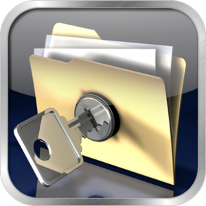
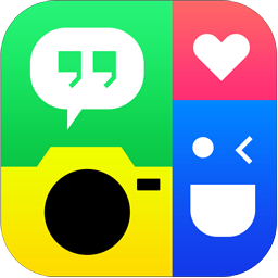
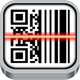
Utility Apps are probably where app icons are really the most important. Most utility apps are found by people searching for a specific function such as a place to hide photos or a QR code reader. These 3 apps are all top utility applications and are Private Photo Vault, Photo Grid, and QR Reader. The icons all describe what the app is going to do before they have even seen the description. This is important because it allows the user to download the app without needing to delve into the description or the screenshots.
2 out of 3 of these apps have an app border that is reflective. App borders are an excellent way to have an app stand out and are found in a large percentage of top apps.
What a utility app icon needs:
- Differentiate – If competition for your type of app is high, make sure that you icon isn’t too similar to another app where it could be mistaken for it.
- Function – Describe the function in the imagery of the icon.
- Quality – The quality of the icon reflects the quality of the utility application. Ensure your graphics are top notch.
FAQ:
Should I use iOS’s gloss effects?
iOS has an option to automatically apply gloss effects to your app icon. This is not recommended any longer since starting in iOS 7, it doesn’t apply the gloss effects which means that your icon will look different depending on what version of iOS someone is running.
Should I make my own icon or hire a designer?
Since an app icon is such a crucial component to an app, if you aren’t an expert graphic designer, I highly recommend hiring a professional graphic designer. Check out the next section for how to hire a graphic designer.
Finding an app icon designer
Finding a good icon designer is actually pretty easy if you know the right places to look. For the past few years, I visited dribbble when I needed some inspiration for an app interface or app icon. (Dribbble is a site where graphic designers show off some of their work and other artists comment on it.) Anyway, after some time, I realized this is the perfect place to recruit graphic designers. The great thing about recruiting from dribbble is that most of the users aren’t posting work that isn’t their own. In my experience on hiring on other platforms such as oDesk, people frequently lie about their portfolio which makes them a poor recruiting choice.
I hope this helped someone who is looking to get a new app icon created. Leave me a comment if you thought this was interesting or if you think anything else should be added.


These are really killer app icons. Research shows that app icon play very important role in app downloads. Its like a first impression on user when searching for app in app store.